
Welcome to my newest series in which I document what the hell I was thinking when I designed a thing, whether that be a book cover, a book trailer, or just a passage in something I’ve written.
I’m a chronic overthinker, so you can rest assured that many thoughts went into the construction. So let’s kick this off this Deconstructing Design with Ground Control, by K.A. Hough.

For the love of God, DO Judge a Book By Its Cover
“Don’t judge a book by its cover…” It’s an old adage, and yes, when it comes to a novel, the content should speak for itself. Unfortunately, you have to actually open the book to discover the wonder inside.
Hence, cover design.
Design should be beautiful, yes, but at its core, the art is always about emotion. Whether we realize it or not, we ask ourselves: How will this book make me feel?
In an ideal world, I’d get to read and digest the full work of a client before working with them, and then I could create a cover that perfectly captures the story world they’ve built. Unfortunately, this is rarely, if ever, the case. Typically a client wants a cover in a reasonable time frame, and as a mom of two with a full time job, this side hustle, and a small business, time is something I can’t guarantee. So instead, I focus on what the reader will want to know, and what the author will love.
This is where a questionnaire comes in handy.
For the Ground Control title, I asked the author K.A. Hough for a few key things: book jacket description, comparable titles, her favorite covers, key passages that capture the story’s ‘heart’ for her, and what emotion she wanted the cover to invoke.
Designing the Heart
Ground Control is a Sci-Fi/Women’s Fiction hybrid that focuses on one woman’s journey to the stars–Mars, in particular. The tagline is, aptly, “There’s No Going Back.” The back jacket reads:
There’s no going back. Fifteen years ago, Sarah was a biology student with a lot of potential. Since then, she’s been coasting and lonely, following her ambitious biologist husband around as he rises through the ranks in his own career. As she packs up to follow her husband again, this time on a one-way mission to Mars, Sarah must face up to the choices from her past. Then, when an unknown bacteria infects the soil on the shuttle, threatening not just the people aboard but the very viability of the Mars program, she must find the strength to finally be true to herself.
Reading this, I automatically knew we wanted to focus our design on Sarah, the protagonist. She’s a woman searching, making difficult choices as she presses onward (and upward).
Secondly, we want to capture the genre. Whether we realize it or not, we intuitively associate a book’s genre with its cover. As readers, we want to find books we know we’ll like, and often use the cover art as our guide. So how to meld Science Fiction with Women’s Fiction in a way that lets potential readers know what they’re getting into?
My mind says we want three things: Sarah, Mars, and Hope.
But what does the client want? I can design something that I love, that meets the constraints and genre, but it will ultimately fail if I’m not considering the client’s preferences. This is why I ask what their favorite covers are (as well as comparable titles).

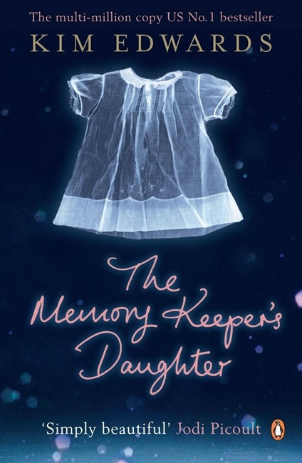

Covers the client loved
Across these three, a few things stuck out–one, there’s an ethereal quality. We have a main character (or something which alludes to them) and an airiness (either in the background itself or in the blur of the background) which evokes mystery. The fonts are in line with Women’s fiction (note the similarity in The Memory Keeper’s Daughter and the Time Traveler’s Wife). So how to marry these features with the novel, Ground Control?
D e c o n s t r u c t e d
I knew I wanted Sarah’s silhouette, and I wanted STARS. In keeping with the Space Between the Stars cover, I began hunting through image after image of women against the sky. Spoiler alert: there are lots.
I ended up selecting one that showed some of the detail of the woman’s face, because I wanted Sarah to feel like a real person we could relate to, rather than a faceless figure. The position of her head and chest (both “held high”) exude a sense of confidence in overcoming difficulty. Then, I cropped the image to focus on just those features. I flipped her to face toward the right, because in western cultures this implies a sense of forward-thinking, looking to the future, and optimism.

So we had Sarah and hope out of the way… the titular figure to encompass the ‘women’s fiction’ aspect of the story.
Now, all we needed was Mars.
Color is a HUGE driver of emotion. I’m particularly a huge fan of blue/teal and orange contrast (you’ll see this in a lot of my work), but the Martian aspect begged for reds.
The other thing I wanted was texture. Planets have a beautiful, rich surface, so I hunted for an abstract art background that captured this. Some color adjustment primed my background to meet the color standards I was hoping for (analogous orange, red, pink, + complementary blue), and then I layered in stars. And more stars. And extra stars (because L.M. Riviere loves stars).
I created a screen with our Sarah image. In this, we see the texture of the world is most prominent within Sarah’s figure, illustrating her internal landscape which drives the story.
…. so then it was time for the TITLE.

As much as I loved the cursive fonts used in the comp covers, neither screamed ‘this is an adventure to Mars!’ So instead, I opted for Unica One due to both its feminine curves and its futuristic roots. It felt like the right choice to meld Science and Women’s Fiction. A textured teal pops against the colors of Mars, and I added a soft white shadow to obtain the ethereal blur noted in the other cover designs. I placed the title “Ground Control” in the bottom third to represent the ‘anchor’ role Sarah plays in her family (also reflected in the title itself).
K.A. Hough’s name balances the image at the top, peeking through the screen and becoming a part of the adventure. A small image of Mars floats in the foreground; a nod to the science fiction part of the story, but minimized to reflect that role it plays in Sarah’s life. Yes, it’s her destination. Yes, it’s her focus. But its a small matter relative to the internal conflict and ‘world’ within her.

So what do you think? Would you judge this book by its cover?
‘Ground Control‘ is available now online everywhere you can buy books.

2 responses to “Deconstructing Design: Ground Control”
[…] Collapse series do, is provide an outlet for our fears (I’ll cover this more in my upcoming Deconstructing Design post). They hold our hands and walk us–from a position of relative safety–through the […]
[…] So in the spirit of looking backward and forward, and recommitting to things long forgotten, I thought I’d revisit an old series: Deconstructing Design. […]